Interview: Lance Wyman


Everybody talks about your work for the Mexico ’68 Olympics, but you’ve worked with many cities since. How is it to design about foreign cultures, as an outsider, let’s say?
Well, I’ve worked with quite a few cities indeed, Mexico probably being the one I had the most involvement in. When I first went to Mexico, I didn’t have any idea of what the city was like, so I learned it as I experienced it. This was great, as I had no preconceived ideas and I was just bowled over by the differences in the two cultures, coming down from New York.
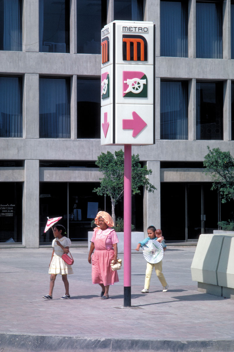
For the metro in Mexico City, I worked directly with the organization that was designing and building the metro itself. So I was working with a lot of architects and engineers, there were over a hundred people in the office. When I started doing the icons for the stations, it was just obvious to ask these people things that they knew about the areas they lived. I think my favorite one was about Candelaria. One of the architects said: “Oh, Candelaria de los Patos.” And I knew enough Spanish at that point, so I asked: “What do you mean ‘of the ducks’?”
Mexico City used to be an island and the Candelaria area was on the waterfront. Apparently, at that time, the criminals’ hangout was on the waterfront. They called them “The ducks.” And to this day, the area is still known as the area of the ducks. So, I used the duck to identify that station. The meaning is two-fold: for someone visiting is that it’s a duck, and then if you have to tell someone how to get to that station or get off at that station, you refer to it as “the duck.” You don’t have to know the history or read “Candelaria” in the Roman letters, you can…
…just remember the duck!
Yeah. That’s really the bottom line, it has to be definable. A duck is a duck.
That’s what matters when you’re on the metro. But could this icon be the key to this forgotten story?
Yes, I think that’s sometimes the case. That’s where history comes in. The stories are sometimes just there, embedded in the icons themselves. But they have to be told. The icon doesn’t tell the story, it represents the story. One of my favorite experiences is when I get an email and someone says, “Oh, thank you for designing that station icon, that was the neighborhood I grew up in,” you know, “I had a shirt with that on it” (laughs)… You’re entering into someone’s life in a way you never expected. That’s always very rewarding.
An icon can also somehow validate a place. Perhaps that’s why you get this kind of emails. People may feel seen or understood. What about the tourists, though? Sometimes they travel just for an icon. They fetishize it.
That happens probably more with landmarks and things that are historically relevant, no?
Design could be a case too. The London Tube, for example. It has this very iconic logo and typeface,
so some people want to be photographed next to it.
Yes, that’s when the system itself becomes a branding landmark, if you will.
Yes, exactly, that’s what I meant.
It was interesting with the metro in Mexico, there was a certain period, maybe in the 80s or 90s, when there was a proposal to change all the typography to Helvetica, when Helvetica was very popular. And they did it, I guess, in some areas. But the people wanted the old typography
back, because, like London, it had a look that was representative of the metro, and people got used to it… I don’t know all the reasons there, but that’s what happened, and they did manage to get it back actually. It’s one of those things that I feel very good about, when something sticks.
The metro map in Washington DC was a really interesting experience too. The map itself became an icon of the city, and when they had to bring a new line in from Dallas Airport, right down through the center of Washington, the people there did not want to change it. They wanted it to look the same way because they were used to it. So, for me it was like designing camouflage, because I had to make changes, but how do you do that without changing the grid, you know? That was another design problem that I never anticipated having.
But how something so emotional, like the sense of place, can be conveyed through something so abstract and analytic like a visual navigation program?
Well, there are two things involved there. There’s the specifics of different locations – the stations in this case of the metro. Then there’s the nature of the system, and this really takes in the whole city, so that you look at it as an experience that’s broken up into these different stations. And once you start understanding that, then the icons on stations, as a form of language, add a very useful layer. Road signs have been doing that for decades. I think some of the best such systems were done in the early European road signs, sometimes by engineers.
So, a lot of this is quite logical, it’s quite scientific in a way.
Exactly, and that’s the paradox of it! How logic brings emotion? I also feel that the end-result is different when an engineer designs something like this.
Well, I think there’s probably a willfulness not to let emotions into scientific thinking. As designers, we’re not only concerned with whether something works, but also with how it works, in the sense of “are you happy with it?” or “does it make people feel good?” There’s a big difference there.
Yes, that’s true. A similar thing happens with typography. It’s all about the shape of the letter and legibility, but then we see strictly typographic covers managing to convey a city’s mood.
Well, that… kind of came in from the back door for me. I studied industrial design and, when I started getting involved with graphics, I had a real fear of picking a typeface. When I returned to New York from Mexico, I was invited by the Type Directors Club to give a talk. It was a real honor, but I never really studied typography, and I always relied on modern and standard typefaces such as Helvetica. So I had to ask them, “Why are you having me talk to the Type Directors Club?” And they said, “Because of the typeface for Mexico 68!” And I never thought of that. Now it’s very common to design a typeface as part of a branding system, but I was doing that just naturally, because I saw it as a basic element, if you will.
It makes sense. You have constructed a geometric
typeface out of your research about a place.
Well, one of the things I was very lucky with is that, when I first went to Mexico and I was discovering the pre-Colombian aspect of the culture, Mexican graphic designers wanted to be like Europe, Switzerland – you know, where design was just coming to life as a formalized profession. But I had never seen such beautiful use of simple geometry as some of these Mexican cultures used for all kinds of things: from representing nature to new forms of storytelling. With a background in industrial design, I was very aware of this directness and I wanted to do powerful visuals like that. I fell in love with graphic design, but I was looking at it in a much more fundamental way.
Sometimes we just need an outsider to make us appreciate our heritage. It is interesting though how citizens embraced your designs, or even use them in some cases, like in the Mexico ’68 upheavals. How do you feel about locals adopting your graphics to amplify their voice?
It’s interesting, in the sense that they’ve become part of the city’s visual language, since they represent certain areas and systems. There was also a big development that was about to happen near one of the metro stops, and the people did an anti-development campaign where they used that metro station symbol. So everyone knew that they were talking about this specific area of the city, and it worked. Their campaign was successful.
Let’s move away from metro maps. You’ve also worked on a fascinating project in Calgary. Tell me about it!
Yes, what they have there is a system of skywalks; long bridges, that is, which connect buildings in various directions. And, believe it or not, when you’re up there, you can get lost very easily.
Sounds like a great place to get lost.
Yeah, and a unique form of space asking for a map. There I discovered how orientation is so important. Normally when people read print maps, they assume north is on the top. But when I made the map for Calgary, I designed it in a circular format, so that it would be rotated and applied in relation to the specific locations. When you’re looking at the map placed on a wall, it’s always oriented according to the way you’re looking at the city. If you’re facing east, east is up and anything to the right is really on the right as you’re standing there.
To facilitate easier reading of the map, I researched what people there use to orient themselves, and Ι found they quite often use local landmarks as points of reference. For example, when walking in the street, everyone knows that to the east of Calgary is the river. So, if you tell someone to go towards the river, it’s like saying go east. Once you become acquainted with it, it’s quite easy. It’s like learning a new app, you know…
Quite a complex map concept to pitch to a client, right?
There’s a funny story, actually. The head of city planning was a hunter, and I knew that because one day he asked me if I could pick up a rifle scope for him from a local optics store. I didn’t feel good about it, I don’t like shooting animals, but I did get him one. So, anyway, in my presentation, I was talking about making the map orient the way you’re looking at it. And he said, “Wait a minute, that’s not necessary,” and I’m thinking, “Oh no, here we go…” But then I replied, “Well, actually it is, I’m sure you know that from hunting!” And he looked at me saying, “You son of gun… Okay, orient the map!” That was unfair… but, you know, it’s unfair to the public if you don’t put things in a way that really can help them.
Is there anything else that you would like to add relating to cities in the sense of place?
I did a program of signs for traffic in Midtown Detroit. This is an essential part of the city, it has a lot of institutions, a really good museum, a lot of cultural things. One of the things that I did when I went out there was to design signs for cars to find their way around. I was aware that there were a lot of problems of policing in that area. And I wanted to get the signs right, so I asked to ride around with a squad car. They said, “We can’t do that,” but I insisted, “No, I want to do that, this is really important, I need to know what goes down there from their point of view.” So, okay, I got two officers in a squad car, and the first thing that I said was, “Look, I’m not doing a report on you guys, I want to know what has to be on these signs to help people here, and I know you deal with this area all the time, so perhaps you can help me.” That changed the whole atmosphere. They really thought about it, and one of them said, “A lot of the cultural destinations are on this side of Detroit, and one of the things that people fear is driving into this area, get lost and get mugged.” So I said, “Well, I guess we know that, but, as a designer, what do I do?…” “Well, put on signs to guide them how to get out of here!” Who the hell would think of that? That was key, and I never would have thought about it. There are two highways on either side of Midtown, so when designing the signs, instead of focusing on icons for the cultural spaces, as someone would have expected, we prioritized displaying information that would help drivers reach these two main highways.
Fantastic, it’s an exit plan.
Yes! And I may have known problems like that exist, but I didn’t have any idea that they had anything to do with the signs, until I sat with those two officers and talked about it.
Thank you for sharing so many stories where graphic design plays such a vital role in experiencing the city. What are you working on these days?
On Movilidad Integrada, a graphics system in Mexico City that is putting the various modes of public transportation, from trains and buses to rental bicycles, into a coordinated visual system.
Back to Mexico then, curious to see how that will be!